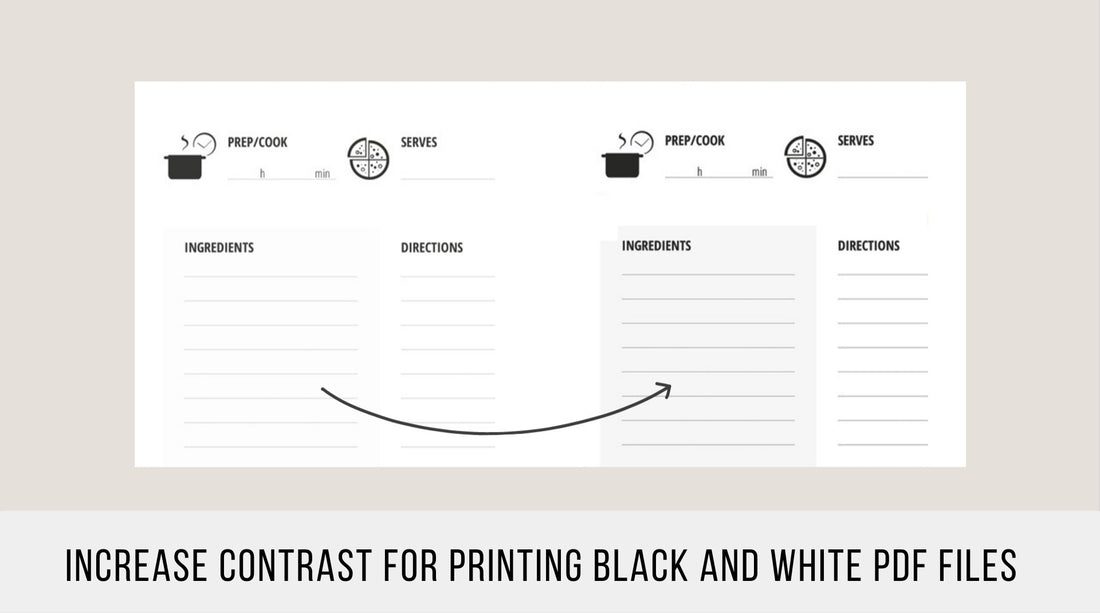
Creating the perfect planner for yourself is not without its challenges. When you want to fill your organizer with special inserts, you become very specific about the design, quality of paper, and certain ink colors for the planner inserts you have envisioned. If you visit any stationery shop, you can touch and feel the paper of the planner refills, and imagine how your written notes would appear inside these lines and tables. You can see the color and thickness of the lines. But when you buy printable inserts online and receive pdf-files for printing, the final result depends on two things:
- the seller’s design and proper settings he/she has chosen for the colors, lines, and graphics of the pdf-file,
- the quality of the paper you have and the settings and capability of your printer to print the files you buy.
After printing an initial version of your insert, there may be some changes regarding the intensity of the color that you would like to make in order to perfect your planner. One such issue is the contrast of the printables, which you can change with the help of your printer settings.
Problem
| “The colors are too faded, I want them to be more black. The lines are too light. The letters are not clear, and the graphic is not pure black. The background color is invisible.” | “I print black and white printables, but the colors are too dark, I don’t want such black lines and dark backgrounds. I want everything to be light grey.” |
 |
 |
Solution 1 – Use Grayscale Option to increase contrast:
You can use your printer’s greyscale setting. Before printing, put a tick in front of this function mode. This option will help make your printable a little bit darker.

Print your desired printable with grayscale function on and off. Depending on your printer, you can see the difference, which is sometimes quite significant. You can try my free printables to see the result using this approach.
Solution 2 – Use Advanced Settings:
You can try advanced printer settings.
![]()
After clicking on it you will see the Color Management setting:

|
If you print only black and white pdf documents, you need only two options: Treet grays as K-only gray Preserve Black Try these two options both separately and together with the grayscale option switched on to see if these changes deliver the results you want. |
Sometimes I see advice encouraging users to select the option“Print As Image”. This will make your printable darker, which is useful if you want to highlight the contrast of an image or improve the readability of the text. But if you use it for high-quality printables, letters will be uneven and graphic lines will not be smooth.
Solution 3 – Increase/decrease contrast for images (Only for Mac Users):
There is one option only for Mac users. It works better for pdf-books, where text is an image itself, but may also work for grayscale pictures as well. All you need to do:
- Open a pdf file through Preview on your Mac.
- Choose “File Export” and find the option Quartz Filter.
- In the drop-down menu choose Lightness Decrease or Lightness Increase, depending on your preference.
- Click Save, but be sure not to replace the original file in case you need it.

I personally don’t like black lines in planner inserts because they distract me from the written content and the page can look messy and sometimes dirty. In my printables, I use grey lines, slight grey backgrounds, and pure black graphics. That makes them clean, clear, and minimalist.
Comments are greatly welcome. Please tell me whether this article helped you and what you do to make your printables perfect.
1 comment
The first solution works. Thank you!